

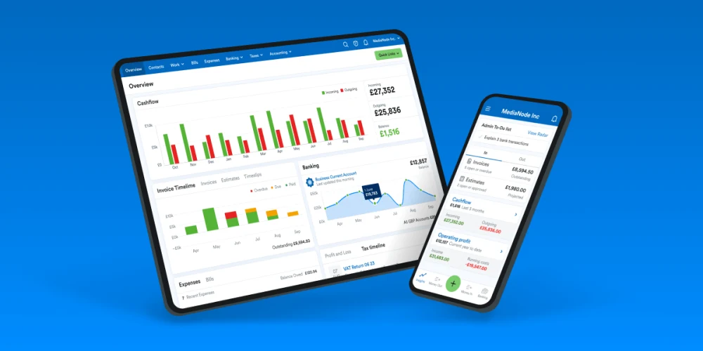
At the beginning of this year the Design System team took on the work of updating the FreeAgent brand, focusing on the web application’s typography, colours and logos (and a few extra bits). You can read more about the new look in Roan’s post.
I want to take you on a journey of what updating a 10+ year old codebase was like and the challenges it brought with it.
The making of a plan
The idea of what the brand refresh would be was relatively straightforward, we knew we had a new logo, new colours, and a new font family to add to the mix.
It wasn’t intended as any huge overhaul to the product, but rather as Roan put it “a fresh lick of paint”.
Sounds pretty straight forward and set in stone, right? If only it were!


This being such a far reaching change across the entire web application, we knew we had to plan for some user testing, we agreed to run a Beta a month before the official launch to gather feedback, and with that we had to consider our technical solutions so that they would enable us to run this test successfully.
The web application is made up of a few key areas for different types of users – admins, practices, and companies. Keeping in mind that we wanted to focus our test we decided that we could keep the beta work to company specific areas only. We still planned to do the work of updating the brand for the entire web app at the same point, but not turning it on for everyone until the final launch date to keep things more manageable technically.
It’s also worth pointing out that we also have a longer term project planned which focuses on updating the overall look and feel of our components to be more in line with the new brand refresh aesthetic as well as updating usability so that customers can easily do the things they need to do without having to think twice about what the UI is telling them. This overlapped in some ways with the brand refresh as will be mentioned later
We set off on the project with a plan:
- Update the logos
- Update the colours
- Update the font family
And so we started with the most straightforward – logos.
Updating the Logos
We had hoped a lot of this task would be straightforward search for and then replacement of images that had the FreeAgent logo in them.
First we ran into some naming and reusability problems- not all the files were named freeagent, or logo, having iterated through a number of naming conventions over the years meant it was a bit more tricky to find them all. But we eventually did, and in order to improve this we created a set logo folder and named our images accordingly so that it makes it quicker to find next time we need to make any changes, it might not be for many years, but it’s there. We also created a helper for rendering the logo, meaning that the majority of use cases won’t need to be updated manually as we can make the change to the re-usable helper instead.
Then there was also the technical issue in that SVGs aren’t supported everywhere – emails and an old PDF generator could not handle them, so we had to create PNG versions of the logos too. It was at this point that we decided against doing the email templates as part of the beta work, it was an area the team had little experience in and our time was best spent first getting the web application aligned with the brand refresh before updating something that had a lot of complexity and not much value for the beta.
And lastly we had not accounted for the favicons and had to get those created and updated too.
Ok, that wasn’t working, let’s make a new plan
Plan B : plan smaller, learn, over communicate, do what we can, improve what we can.
The logos were the least of our problems in the long term so it had us worried about what unknown unknowns were awaiting us with fonts and colours and how we would deal with the challenges presented to us. Let’s take a look at how that went!
Updating the Colours

We made quite a big decision to use CSS custom properties early on for colours, this was a huge improvement in enabling us to use more modern native tech to achieve results and make our code more extendable and readable, we were using SASS variables previously and they did the job but we could do better.
As a comparison, below is an example of SASS variables being used and the output, because variables are updated to their raw values when compiling, you lose all context of where they are set in the final compiled code.
// SASS
// variable set
$fa-green: #79cc6e;


//pre-compiled code
.fe-Button {
  background-color: $fa-green;
}


//compiled code
.fe-Button {
  background-color: #79cc6e;
}
Compare this to what you see when using CSS custom properties below, you get a lot more contextual information that can be more easily traced back to where the variable is declared, allowing for easier debugging and clearer understanding of what values are being used by their name.
// CSS custom properties
// custom property set
:root {
--fa-green: #79cc6e;
}


//pre-compiled code and compiled code look the same
.fe-Button {
background-color: var(--fa-green)
}
We saw the benefits of this when we had to set a different drop shadow colour depending on which part of the application it was in, with custom properties it was really straightforward to replace the value compared to doing it using SASS variables. (Read CSS tricks’s complete guide to custom properties for more details – pros, cons and how to use them)
One complication that we came up against was the charting library that we used in a variety of different ways over the years to achieve different types of charts, and in doing so had a variety of places and ways that we set colours within those charts. We documented where each chart colour was set and noted it down as an area of improvement for the future.
Updating the Fonts
The fonts were where we learnt the most about the unknown unknowns.
Ligatures were the first thing, it wasn’t something we hadn’t had to think about much with our old font face but became clear one we replaced the font that it created some unwanted outputs, this was easily fixed by setting font-variant-ligatures: none;

How we displayed numbers was another big problem, the spacing was quite a bit different with the Circular font face, by default it wasn’t consistent and made it hard to read when numbers were displayed in tables in particular. We had to use font-variant-numeric: tabular-nums; to achieve a consistent layout to help readability.
And although it wasn’t a display issue, we had to maintain 3 different font scales while we were working to ensure consistency in scale for everyone whether in beta or not. We had to spend more time thinking about the implications of that than we had anticipated.
Updating the Buttons and Cards
After some back and forth working through the pros and cons and evaluating the complexity of updating buttons and cards not only to the brand refresh but also to the new brand look and feel that was planned as part of the envisioning work. We decided the risk and effort was worth it.

There were some technical challenges with updating these as they can be seen on every single page on the site and have a few variations each, because of the age of the codebase we did also accept that while we can update as many instances as possible there may be some that are missed but we would fix those forward where possible.
In terms of the technical work, as a very short term solution we used :where to render styles that were specific to the beta and non-beta using a class we set on the page depending on if the feature was on or off. As we were changing a large amount of features of how the button looked and responded to interactions we opted to keep those styles very separate in code blocks to allow us to delete the old styles swiftly once we were live to all users.
We heavily relied on our visual regression tests to flag up any major issues, but as any test suite, it’s not foolproof and so we accepted some things to be fixed forward once we found them, having the suite of tests was invaluable to this project.
Releasing our changes at last
As the Beta went out, we had a few changes based on feedback but nothing major, our thorough testing and technical approaches meant we didn’t have a hard time fixing the things that did come up, and even the most major change – a tweak to the logo colour for contrast, didn’t end up taking very long to implement.
The live release was a massive undertaking across the whole company as all teams aligned with times and clear responsibilities so that we were consistent in showing our new branding across many different channels of communication, but it was a huge sigh of relief knowing the part we had to play in it went well.
So, what did we learn?
Over communication is key
Having open and honest communication about limitations and striving for a balance between design and engineering. Focusing on what we could do, rather than what we couldn’t or didn’t have the time to do with the tight deadlines ahead of us and communicating that early and often so we could make a well informed decision.
Compromises are necessary
One key example of this was email templates – there were technical limitations with this and added complications if we were to include this in the beta, after some discussions it was agreed that we would instead roll this out with the live launch.
Visual regression tests are worth it
Visual regression tests were invaluable to us when making so many global changes. We plan to improve the coverage of these tests to automate some of the verification of changes going forward.
Design systems make changes easier
Componentisation makes global changes more straightforward, the more different versions we had of a component the longer it took to verify that it was working as expected. It motivates us to aim to have our web application using as many of the design system components throughout.
Planning tech debt saves time
Planning for tech debt meant we could plan writing our the code in a way that it’s easier to tear out once it’s not needed, and just the act of keeping a list as we went, knowing what needs to be reverted or cleaned up meant we didn’t have to spend a huge amount of time thinking through what needs to be done and instead we could simply get on with doing the work.
We planned for the cleaning up of old code and assets to happen soon after the release of the brand refresh so that we aren’t acquiring more tech debt while new features continue to be developed on top of that code. We also wanted to lower the mental workload of anyone working around the feature flagging aspect of the code as soon as possible.