On 16th May it’s Global Accessibility Awareness Day, a day to “get everyone talking, thinking and learning about digital access/inclusion and people with different disabilities”.
At FreeAgent, our mission is to make small businesses happier and more successful by putting them in control of their finances. A big part of that mission is building software that is accessible and inclusive, so that we can help as many people as possible, regardless of their situation.
But our app is now over 12 years old, and we haven’t always been that focused on accessibility. It’s taken a relatively recent push for us to reach a place where we feel accessibility is front and centre of our design process.
How we started our accessibility group
Paddy, one of our product designers, attended the 2017 Accessibility Scotland conference and came back with a few ideas to improve the accessibility of our product as well as awareness throughout the company.
There were a few accessible components in the app already, but they were scattered and untested. What we didn’t have was a clear strategy for approaching accessibility. The first step to rectifying that was to start talking more and raising awareness about accessibility and inclusive design.
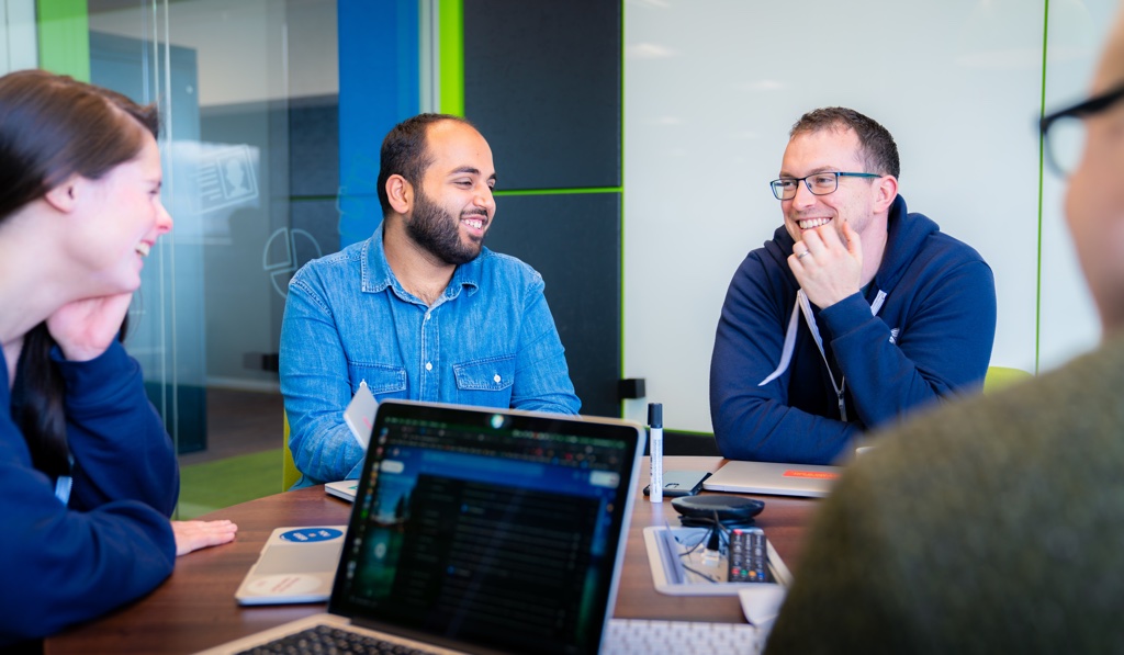
We set up a fortnightly Accessibility Forum to discuss the current state of the application, solicit feedback on new components, share interesting stories and articles, and mostly give us a place to ask a lot of questions.

Getting together regularly was a huge boost in confidence: we realised we were mostly doing the right things so far, if a little haphazardly. Very quickly we realised that we probably didn’t need a very formal plan to start making decent improvements.
As part of our Making Tax Digital work with HMRC, we also performed our own impromptu accessibility audit for our MTD journey. We used the axe tool to identify places that didn’t meet the Web Content & Accessibility Guidelines (WCAG) 2.0 standard, and recorded all the issues in a big spreadsheet. By the end, we had a pretty good overview of how well FreeAgent measured up.
It was an eye opening experience and it got us talking more about accessibility, to the point where we have Key Performance Indicators around increasing the accessibility of our application and we’ve also started using accessibility exit criteria for our user stories!
Practically applying our new accessibility knowledge
Since we’ve started the forum and built up more confidence around this area, we’ve also started applying our new accessibility knowledge to improve our application.
We address a bunch of accessibility concerns in FreeAgent, based around the four aspects covered by the WCAG: visual, auditory, cognitive, and motor.
Visual
We make sure our app has enough contrast and accessible colours. We always ensure that the colours pass the WCAG minimum colour contrast ratio. Our designers use the Stark Sketch plugin to test the contrast ratio of text to its background colour. We also use labels or distinctive icons in combination with colour to convey meaning.

Auditory
We make sure all of our knowledge base instructional videos are closed captioned. We use a couple of services for this – Rev and Wistia. On top of that, our award winning support team is reachable by email or chat, which benefits not only our users with hearing problems, but all kinds of customers that are not comfortable with using a phone.
Cognitive
We put a lot of effort to make sure the terms we use throughout the application and our knowledge base are easy to understand and avoid accounting jargon as much as possible. We keep the content easily scannable and use short, easy to follow sentences. We also ensure consistency in colours, fonts, and locations of the elements in the page.
Motor
We try to make sure our app is fully navigable with a keyboard, as well as a mouse or touch screen. We don’t mess with tab order or move things around with JS or CSS, and we use native, semantic HTML elements instead of custom components as much as possible (this also helps with the visual and cognitive aspects).
What we’re doing for Global Accessibility Awareness Day
This accessibility awareness day, we will try a couple of things to help raise awareness throughout the company. We’ll be running a “no mouse challenge” where people will try and use their computer without a mouse for a day (or however long they last). We will also be delivering screen reader demos of our app.
Our next steps to improve accessibility
- Greater emphasis on inclusive design
- Introducing a component level and end to end automated accessibility testing tool such as tenon.io
- Raising awareness internally
- We know it’s not right yet, but once we’re confident about the accessibility level of our application, bringing in a 3rd party company to do an audit
Promoting accessibility in your own workplace
You may be in a similar position to the one we were in a little over a year ago: you’re excited to improve your product’s accessibility, and there’s no outright objections from the rest of the business, but there’s no plan in place yet either. It can seem like an intimidating task to take on, but it’s probably not as daunting as it first appears.
Here are a few tips, based on our experience, for promoting accessibility in your own workplace:
- Talk about it – set yourself a goal to learn a little bit about a given topic, and then share it with your team or a wider audience (we do this by presenting a short segment in our regular forum, or through town hall talks to the whole business)
- Start a forum of interested folks – accessibility is a topic a lot of people are aware of, but they may not have the confidence to take on by themselves. Search out co-workers who feel similarly to you and start meeting regularly to discuss your concerns.
- Ask around the company for people who have experienced accessibility issues (there’s probably more than you think) and ask them if they would like to talk about their experiences – this doesn’t need to be in a public forum. Just chatting one-to-one can help you learn about their difficulties, and you can always share this with others later, anonymously if need be.
- Solicit accessibility feedback from your customers – if they’re anything like our customers, they’re probably telling you anyway, but you’d be surprised how many people are battling through inaccessible software because there’s no good accessible alternative.
- Try using accessibility exit criteria for user stories – these can start really simple, and focus on just one or two areas to begin with, such as “search suggestions can be read and selected while using a screen reader”.
- If you’re in a position to influence the company’s hiring strategy, look for candidates with accessibility experience – if you manage to hire them, try and get them to bring their expertise into your working group. They may also have past experience of promoting accessibility in other companies.
- Find a way to measure your progress and momentum – this is so that you can see the positive changes you are making even when the whole thing isn’t “fixed” yet. For example, we used the output from our first internal audit as a baseline. We then went back to it as we fixed known issues to track how much we were improving.
It might not be a very smooth ride at all times, but try to keep up your momentum, even if it’s just in small ways. Soon enough you and your users will start to see the benefits. As you get more confident about making small changes and measuring their impact, the benefits will start to become visible to the rest of your team. And remember, when you make your software accessible, everybody wins!
Anda Popovici is a software engineer on FreeAgent’s product team and Paddy Duke is a product designer for FreeAgent


